Design Tips
Some handy hips for designing your perfect framed banners.
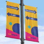
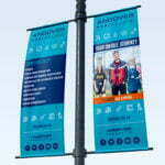
A-frame banners, wall framed banners, lamppost banners or café barriers – they are all a key marketing tool for any business. Perfect for sharing vital information and promoting your brand. Getting the design right is just as important as the message you are sharing on your display banner.
The banner layout needs to be thoughtful, simple and eye-catching. Designing your framed banner is just like designing a poster, it requires thought and needs to match your other marketing items. Make sure your framed banner is attractive to the eye – from close up, and from afar.
Offered in a range of sizes, most banners are long and thin in nature. Stick to our “design in thirds” rule: Key message, content and contact information. With this rule of thirds in mind, we asked our studio to share a few top tips with you.
Templates: To ensure your design will be the perfect fit, download one of our free templates.
Logo Placement: Simple! Place it at the top of your banners! Eye-catching and visible from a distance. Its positioning will let everyone know who you are!


Text Layout: Text left to right – we all read left to right. Your potential customers are no different. So don’t make reading your banner hard for them. Disjointed and random layouts of text can cause confusion, and in turn your overall message or impact can be lost. Align your text, keep sentences short and layout text to be read left to right. Text should be placed in the middle third of your design.
Font Styling: Try not to use more than two different fonts in your design. Keep it simple for maximum readability.
Image Placement: Make sure any images are high resolution enough to be printed. See our artwork setup guide for more information. Make sure imagery does not obstruct any text. It can be tempting to place large point size text over the top of an image; however, this often makes text hard to read. Text and/or imagery should be placed in the middle third of your design.
Social Media: Social media icons and hashtags can be added but don’t overcrowd the space. We recommend you use between one and three pieces of contact information in total. This should sit in the bottom third of your design.
Top Tips Summary
- Use a template
- Logo at the top
- Layout text left to right
- Only use two fonts
- Consider image placement
- Use social media icons
Once you have designed your framed banner, double checked all of the information and created a high-resolution PDF – your design is ready.
Need help with preparing your design?
Get in touch for expert advice and support today
